ART STUDIO SECRETS
As artists we each gather a unique array of tips, techniques, and inspirations throughout our careers. Here are some of my “Art Studio Secrets” from my books and some new and expanded ones. I invite you to share some of your discoveries here, too. Post your feedback in the comments.

Search
Events and Happenings

Kleo Kats Prints Are Available for the First Time!

After receiving many inquiries, we have canvas prints, posters, metal prints, and more of all eight Kleo Kats available here, at Fine Arts America

Click on Audubon below and it will bring you to his page. From there you can find each of the other Kleo Kats. Please visit and let us know how it goes.

Photography Prints


Gallery Exhibit

See my latest works in the Hidden Treasures series. Showing
June 24
and extended through
 
December 1, 2014
at the
Judith Kaufman Gallery in the 
Historic El Portal Theatre
5269 Lankershim Blvd.
North Hollywood, California 

Learn More > 

Connect with Marjorie
Award Winning Best Seller

Winner of Two Awards at the inaugural Dan Poynter Global eBook Awards!

Best Art/Graphics eBook
Non-Fiction
Best eBook Cover
Non-Fiction

151 Uncommon and Amazing Art Studio Secrets

84 pages, black and white

Buy Now – Choose Format
$7.99 Paperback
$2.99 Kindle, Nook, or iBook


ALL NEW!

151 Effective and Extraordinary Art Studio Secrets

110 pages, black and white

Buy Now – Choose Format
$7.99 Paperback
$2.99 Kindle, Nook, iBook


NEW!

210 Imaginative Ideas for Painting

166 Pages

Buy Now – Choose Format
$10.95 Paperback
$4.95 Kindle, Nook, iBook


Get “Art Studio Secrets” in Your RSS Reader
Navigation
Friday
Jun062014

Getting White to Work

What do snow, lilies, clouds, teeth, whipped cream, and polar bears have in common? If you said the color white, you’re wrong. Each is a pale color with only highlights that are truly white.

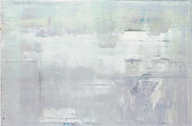
This work shows the temperature and value range of the color white. Gerhard Richter, Abstract Painting (911-2), 2009, 78 3/4 in. x 118 1/8 in., Courtesy of Marian Goodman Gallery, New York. (Click on painting for link.)

When painting a white object observe that it often has warm color tints in the light with cool tones in shadow. White things pick up color reflections from their surroundings, too. They're more colorful than first meets the eye.

Which White is Right?

White is essential for every palette of colors. The more opaque the white, the greater its tinting power but the more it will diminish the vibrancy of a color. White also tends to cool a color.

Here are popular whites for oils, acrylics, and watercolors and an outline of their differences.

  • Titanium White: opaque, warm, dries slowly, slightly flexible
  • Zinc White: transparent, cool or neutral, dries slowly, brittle. It's often preferred for mixing because it doesn't overpower a hue. Good for glazing and scumbling techniques
  • Titanium-Zinc White or Mixing White: neutral, all-purpose, combines the best of two pigments. Try mixing your own formula
  • Flake White: warm, dries slowly, flexible, contains toxic lead. Avoid it.
  • Flake White Hue: flake white without the toxic lead
  • Transparent White: weakened titanium formula, good for mixing
  • Chinese White: term used for zinc white watercolor formulas
  • Gamblin Radiant White (oil only): neutral, brilliant light reflective quality
  • Bob Ross Soft White (oil only): wonderful creamy texture 

TIP: Add a bit of cadmium orange to white for a sunlit feeling. Use it against cool shadow tones to heighten drama, especially in a landscape.

EXERCISE: Making It All White  Try creating a painting in high key (light values.) You'll become aware of subtle value and temperature relationships. Add brighter colors and darker accents sparingly. Create texture for excitement. A "white" palette produces a unified piece with harmony and appeal. 

*

When painting with white, you're working with color—however light. And if you make textural brushstrokes, you're creating shadows too, which provide more color and values. White is anything but sterile; it's colorful and dynamic.

Friday
Jan102014

Multi-monotones – Create Subtle Color Harmony with a Note of Excitement

Spanish artist Pablo Picasso painted "The Old Guitarist" in 1903 during his Blue Period. The monotone painting is mainly in shades of blue. Notice how he adds a slight greenish cast to the flesh, and uses a warm neutral accent for the guitar. Image courtesy of wikipaintings.org.A monotone (or monochromatic) painting is an artwork painted in a single color using a range of darks, lights, and half tones to show form. The values you use are more effective than color for showing the forms of things because values tell how surfaces catch light.

Old masters painted gray under-paintings, called grisaille, to establish form before adding color to their canvases. Today artists often use earth tones as a warmer alternative. 

For finished paintings a monotone color scheme provides built-in color harmony. However, monotones can lack vitality. Here's an approach I call multi-monotone because it uses color variations of a single dominant hue. For example, if your hue is green it would include yellow-greens and blue-greens. Blue would include greener blues and purple-blues. 

These color schemes are not fully analogous (colors next to each other on the color wheel) but move slightly in that direction. Subtle nuances of color become significant in a single-hued artwork. 

There are three ways to create a range of darks and lights with a single hue.

  • Use black or umber for darkening a color and white to lighten it. With this approach your colors may be boring. 
  • Use a chosen color as your darkest dark and add white for lighter values. Note that inherently lighter hues such as yellow will lack contrast. The result with any color may lack interest, as well.
  • For a richer approach use your color's complement to mix darks and neutrals and use white to make lighter values. This is a great approach for developing a multi-monotone piece.

Try this exploration: Divide a canvas in fours and paint the same subject in each section in a different dominant hue, using the complementary color for dark and white for lights. But alter your dominant hue with its adjacent colors. You'll see dramatic differences in the moods the colors impart in each section.

Beautiful color harmony is a balance between unified color and a note of excitement. 

I wish a healthy and happy new year to all!

Sunday
Sep222013

Dot-ism

French post-impressionist Georges Seurat originated Pointillism, a masterful version of dot-ism. His "La Parade de Cirque" was painted 1887–88. Image courtesy Wikimedia.

Dots create appealing textures in paintings. Whether you work representationally or not, think of dots as bits of color your eye will mix.

Dot Your Eyes

Study shading by painting a simple subject like a pear or a face by using light and dark dots to show form.

Work onto a middle-toned surface and think of your dots as short brushstrokes. Use light and dark values to depict main lights and shadows. Mingle dots to create more values. Spacing dots closer and further apart creates additional values. Use any colors if their values are right. Your subject will look surprisingly realistic from a distance because dots mix optically.

Angelo Franco creates a contemporary version of the style in “Floral Abstraction Tangier.”

Original Aboriginals

Australian Aboriginal Dot Paintings have slightly raised dots painted over flat earth-colored shapes. The artists depict animals and nature, using color symbolically: yellow = sun, brown = earth, red = sand, white = clouds and sky.

Dotting the background on aboriginal art would hide symbols that the uninitiated were not allowed to see. Today it is used for decorative purposes only. Image Courtesy of Aboriginal Life.

Heavy paper or any board works well. Avoid springy canvas. Using acrylic paint, cover your substrate in large areas of flat color. Apply uniform sized dots over background areas, letting them flow across areas to unify the composition. Add smaller dots for details, larger dots for emphasis. Concentric dotted circles and dotted outlines around shapes are typical of Aboriginal Dot Paintings. The paint application itself will cause the dots to be slightly raised.

Good dot-maker tools are backs of brushes and pointed-tip squeeze bottles of paint. Experiment to find the tools and paint viscosity that works best. Gloss dots over matte backgrounds add drama. Adapt this indigineous style through your own subject matter and colors.

*

If you haven’t thought of dot-painting until now, it can be a fresh new way to approach your art.

This article is adapted from Marjorie Sarnat's new book, 210 Imaginative Ideas for Painting and appeared in the May 2013 issue of California Art League – Creative Edge Newsletter.

Monday
May062013

Palettes of the Masters

The Cliffs at Etretat by Claude Monet. Image courtesy Wikimedia

Color is the magic ingredient that evokes emotional response in a painting. Learn from the masters, both past and contemporary.

Here are some oil palettes the masters have used. Although their pigments vary, the palettes have four factors in common:

  • limited palette
  • range of light/dark values
  • range of warm/cool temperatures
  • usually include a version of the primaries

REMBRANDT (1606 – 1669)
Earthy colors: flake white, yellow ochre light or Naples yellow, vermillion, alizarin crimson, burnt sienna, burnt umber, ivory black. Transparent blue, such as pthalo or ultramarine, broaden the palette.

MONET (1840 – 1926)
“…the most important thing is to know how to use the colors. Their choice is a matter of habit. In short, I use white lead, cadmium yellow, vermillion, madder, cobalt blue, chrome green. That’s all.”
– Claude Monet

RENOIR (1841 – 1919)
“On the whole, the modern palette is the same as the one used by artists of Pompeii-- I mean it has not been enriched. The ancients used earths, ochres, and ivory-black. You can do anything with that palette.”
– Pierre-Auguste Renoir

VAN GOGH (1853 – 1890)
“I am crazy about two colors: carmine and cobalt. Cobalt is a divine color and there is nothing so beautiful for creating atmosphere. Carmine is as warm and lovely as wine…”
– Vincent Van Gogh

GUSTAV KLIMT (1862 – 1918)
Predominantly golden yellows, light yellows, ochres, browns, greens, and gold leaf. A bit of red, blue, and white round out the palette.

JOE ABBRESCIA (1936 – 2005)
One warm and one cool of each primary plus a range of neutrals, excluding black.

RICHARD SCHMID (1934 –)
Cadmium Lemon, Cadmium Yellow Pale, Cadmium Yellow Deep, Yellow Ochre Light, Cadmium Red, Terra Rosa, Alizarin Crimson, Transparent Oxide Red, Viridian, Cobalt Blue Light, Ultramarine Blue Deep, Titanium White.

These are versatile palettes that apply to acrylics and watercolors, too. Experiment while following your natural instincts.

Monday
Apr152013

Art Technique and Product Roundup

In this entry I offer some tips and product ideas worth considering. I hope you find something you can apply. 

Radiant Oil Colors

Try Gamblin radiant oil colors. They’re truly “radiant” and more light reflective than other oil colors. The radiant white is fantastic for mixing bright light colors. The others are gorgeous pastels to use straight from the tube or mixed with other colors. I use them to add a lively note to grays. My personal favorite is Radiant Violet. 

Soft Oil Paints

Titanium White from the Bob Ross Floral Soft Oil Colors assortment is incredibly soft and facilitates smooth blending. Pink is another versatile choice. If you paint landscapes, use pink to make greens both lighter and dustier.

Poppy Seed Oil

Charvin Extra Fine oil colors are made with poppy seed oil. They’re wonderfully creamy and responsive to your brushstrokes, won’t yellow, and mix with all oil paints. Try white and a couple of trial colors. Poppy seed oil also comes in bottles for adding to paints. It dries slower than linseed oil, so if you like a soft painterly look, they’re worth exploring.

Painting on an Easel—Literally

Some artists use their easels as palettes! They squeeze out their paints on regular palettes, but mix colors right on the easel supports! Use wood or metal easels, full scale or tabletop. Acrylic paints are practical because they dry fast, but oil paints work beautifully, too. 

After completing some paintings this way, you'll have generated a bonus masterpiece: an avant-garde artwork in the form of an easel. Your colorful easel will serve as an attention getter for displaying your paintings, too.

Varnish-Turp Magic

Try amazing transparent effects over a thoroughly dry oil painting. It works best on paintings of flat texture without heavy brushstrokes. Mix a solution of retouch varnish and 10% transparent oil color. I create a neutral from ultramarine blue and burnt sienna, but color is up to you.

Lay your painting flat and use a soft brush to coat the entire surface with the varnish solution. For areas where you want less color concentration, use varnish only. Now splatter and dribble turpentine onto the wet coating. Rings and organic shapes will develop and spread as the coating dries. To minimize the spreading effect dry your painting quicker by laying it in the warm sun--if possible.

Alcohol-Acrylic Magic

Create amazing effects by mixing a solution of 50% acrylic paint with 50% water. Apply the mixture to a dry canvas or board, which may or may not have been coated with acrylics. While the solution is still wet on your surface, splatter, drop, or dribble 91% alcohol onto your surface. The alcohol creates exciting rings and spots. Move the color around with a chopstick or brush handle. If you tilt your canvas, the alcohol will marbleize the paint. 

Try mixing metallic paint or iridescent powder into your 50-50% solution. Alcohol makes the metallic color separate from your acrylic color, creating outlined rings and surprising effects. Create layers of effects, letting the canvas dry flat between applications. This technique makes wonderful backgrounds as well as being their own statements.

*

Adding new products and techniques to your repertoire can put a jolt of freshness into your art without significantly changing your narrative. 

I have no affiliation with the products mentioned. This article first appeared in the February issue of "The Creative Edge," the newsletter of the California Art League.