Palettes of the Masters
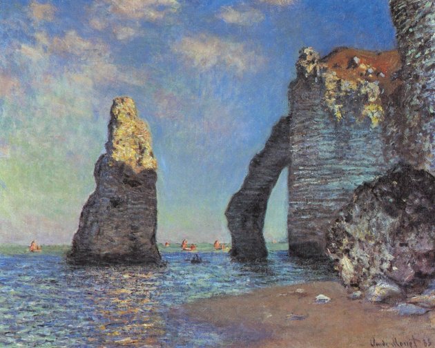 The Cliffs at Etretat by Claude Monet. Image courtesy Wikimedia
Color is the magic ingredient that evokes emotional response in a painting. Learn from the masters, both past and contemporary.
Here are some oil palettes the masters have used. Although their pigments vary, the palettes have four factors in common:
- limited palette
- range of light/dark values
- range of warm/cool temperatures
- usually include a version of the primaries
REMBRANDT (1606 – 1669)
Earthy colors: flake white, yellow ochre light or Naples yellow, vermillion, alizarin crimson, burnt sienna, burnt umber, ivory black. Transparent blue, such as pthalo or ultramarine, broaden the palette.
MONET (1840 – 1926)
“…the most important thing is to know how to use the colors. Their choice is a matter of habit. In short, I use white lead, cadmium yellow, vermillion, madder, cobalt blue, chrome green. That’s all.”
– Claude Monet
RENOIR (1841 – 1919)
“On the whole, the modern palette is the same as the one used by artists of Pompeii-- I mean it has not been enriched. The ancients used earths, ochres, and ivory-black. You can do anything with that palette.”
– Pierre-Auguste Renoir
VAN GOGH (1853 – 1890)
“I am crazy about two colors: carmine and cobalt. Cobalt is a divine color and there is nothing so beautiful for creating atmosphere. Carmine is as warm and lovely as wine…”
– Vincent Van Gogh
GUSTAV KLIMT (1862 – 1918)
Predominantly golden yellows, light yellows, ochres, browns, greens, and gold leaf. A bit of red, blue, and white round out the palette.
JOE ABBRESCIA (1936 – 2005)
One warm and one cool of each primary plus a range of neutrals, excluding black.
RICHARD SCHMID (1934 –)
Cadmium Lemon, Cadmium Yellow Pale, Cadmium Yellow Deep, Yellow Ochre Light, Cadmium Red, Terra Rosa, Alizarin Crimson, Transparent Oxide Red, Viridian, Cobalt Blue Light, Ultramarine Blue Deep, Titanium White.
These are versatile palettes that apply to acrylics and watercolors, too. Experiment while following your natural instincts.




 Share Article →