ART STUDIO SECRETS
As artists we each gather a unique array of tips, techniques, and inspirations throughout our careers. Here are some of my “Art Studio Secrets” from my books and some new and expanded ones. I invite you to share some of your discoveries here, too. Post your feedback in the comments.

Search
Events and Happenings

Kleo Kats Prints Are Available for the First Time!

After receiving many inquiries, we have canvas prints, posters, metal prints, and more of all eight Kleo Kats available here, at Fine Arts America

Click on Audubon below and it will bring you to his page. From there you can find each of the other Kleo Kats. Please visit and let us know how it goes.

Photography Prints


Gallery Exhibit

See my latest works in the Hidden Treasures series. Showing
June 24
and extended through
 
December 1, 2014
at the
Judith Kaufman Gallery in the 
Historic El Portal Theatre
5269 Lankershim Blvd.
North Hollywood, California 

Learn More > 

Connect with Marjorie
Award Winning Best Seller

Winner of Two Awards at the inaugural Dan Poynter Global eBook Awards!

Best Art/Graphics eBook
Non-Fiction
Best eBook Cover
Non-Fiction

151 Uncommon and Amazing Art Studio Secrets

84 pages, black and white

Buy Now – Choose Format
$7.99 Paperback
$2.99 Kindle, Nook, or iBook


ALL NEW!

151 Effective and Extraordinary Art Studio Secrets

110 pages, black and white

Buy Now – Choose Format
$7.99 Paperback
$2.99 Kindle, Nook, iBook


NEW!

210 Imaginative Ideas for Painting

166 Pages

Buy Now – Choose Format
$10.95 Paperback
$4.95 Kindle, Nook, iBook


Get “Art Studio Secrets” in Your RSS Reader
Navigation

Entries in color (4)

Friday
Jan102014

Multi-monotones – Create Subtle Color Harmony with a Note of Excitement

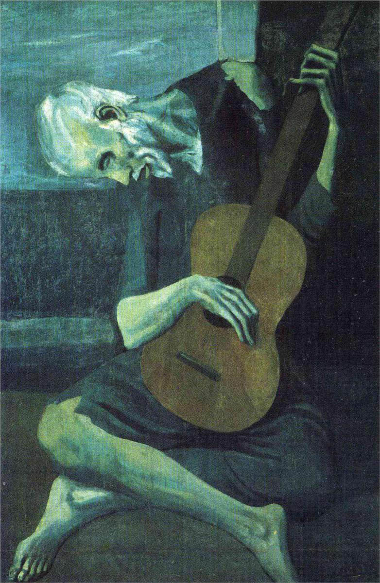
Spanish artist Pablo Picasso painted "The Old Guitarist" in 1903 during his Blue Period. The monotone painting is mainly in shades of blue. Notice how he adds a slight greenish cast to the flesh, and uses a warm neutral accent for the guitar. Image courtesy of wikipaintings.org.A monotone (or monochromatic) painting is an artwork painted in a single color using a range of darks, lights, and half tones to show form. The values you use are more effective than color for showing the forms of things because values tell how surfaces catch light.

Old masters painted gray under-paintings, called grisaille, to establish form before adding color to their canvases. Today artists often use earth tones as a warmer alternative. 

For finished paintings a monotone color scheme provides built-in color harmony. However, monotones can lack vitality. Here's an approach I call multi-monotone because it uses color variations of a single dominant hue. For example, if your hue is green it would include yellow-greens and blue-greens. Blue would include greener blues and purple-blues. 

These color schemes are not fully analogous (colors next to each other on the color wheel) but move slightly in that direction. Subtle nuances of color become significant in a single-hued artwork. 

There are three ways to create a range of darks and lights with a single hue.

  • Use black or umber for darkening a color and white to lighten it. With this approach your colors may be boring. 
  • Use a chosen color as your darkest dark and add white for lighter values. Note that inherently lighter hues such as yellow will lack contrast. The result with any color may lack interest, as well.
  • For a richer approach use your color's complement to mix darks and neutrals and use white to make lighter values. This is a great approach for developing a multi-monotone piece.

Try this exploration: Divide a canvas in fours and paint the same subject in each section in a different dominant hue, using the complementary color for dark and white for lights. But alter your dominant hue with its adjacent colors. You'll see dramatic differences in the moods the colors impart in each section.

Beautiful color harmony is a balance between unified color and a note of excitement. 

I wish a healthy and happy new year to all!

Monday
May062013

Palettes of the Masters

The Cliffs at Etretat by Claude Monet. Image courtesy Wikimedia

Color is the magic ingredient that evokes emotional response in a painting. Learn from the masters, both past and contemporary.

Here are some oil palettes the masters have used. Although their pigments vary, the palettes have four factors in common:

  • limited palette
  • range of light/dark values
  • range of warm/cool temperatures
  • usually include a version of the primaries

REMBRANDT (1606 – 1669)
Earthy colors: flake white, yellow ochre light or Naples yellow, vermillion, alizarin crimson, burnt sienna, burnt umber, ivory black. Transparent blue, such as pthalo or ultramarine, broaden the palette.

MONET (1840 – 1926)
“…the most important thing is to know how to use the colors. Their choice is a matter of habit. In short, I use white lead, cadmium yellow, vermillion, madder, cobalt blue, chrome green. That’s all.”
– Claude Monet

RENOIR (1841 – 1919)
“On the whole, the modern palette is the same as the one used by artists of Pompeii-- I mean it has not been enriched. The ancients used earths, ochres, and ivory-black. You can do anything with that palette.”
– Pierre-Auguste Renoir

VAN GOGH (1853 – 1890)
“I am crazy about two colors: carmine and cobalt. Cobalt is a divine color and there is nothing so beautiful for creating atmosphere. Carmine is as warm and lovely as wine…”
– Vincent Van Gogh

GUSTAV KLIMT (1862 – 1918)
Predominantly golden yellows, light yellows, ochres, browns, greens, and gold leaf. A bit of red, blue, and white round out the palette.

JOE ABBRESCIA (1936 – 2005)
One warm and one cool of each primary plus a range of neutrals, excluding black.

RICHARD SCHMID (1934 –)
Cadmium Lemon, Cadmium Yellow Pale, Cadmium Yellow Deep, Yellow Ochre Light, Cadmium Red, Terra Rosa, Alizarin Crimson, Transparent Oxide Red, Viridian, Cobalt Blue Light, Ultramarine Blue Deep, Titanium White.

These are versatile palettes that apply to acrylics and watercolors, too. Experiment while following your natural instincts.

Friday
Sep282012

Color Secrets

“In visual perception a color is almost never seen as it really is – as it physically is. This fact makes color the most relative medium in art.” – Josef Albers

Your color choices will greatly influence the viewer’s emotional reaction to your paintings. Remembering some general rules can help you express your ideas. 

“Audubon” from the Kleo Kats series, by Marjorie Sarnat

Know Your Relatives

Color is always relative. If a color is not working in your painting, adjusting the colors near it often solves the problem. For example, make a color appear brighter by surrounding it with duller colors. Surrounding areas have a profound effect upon the appearance of any color.

Keep It in the Family

A painting should have a dominant hue, with approximately ¾ in one color family. The remaining areas work well with complementary hues or another color temperature.

Brightening Up

Metallic acrylics mixed into acrylic white create gorgeous pastels that look non-metallic, but have a vibrant, less chalky hue than achieved by mixing flat colors into white. A bit of metallic color mixed into any flat color will intensify its hue, too.

Colors Have Character

When a painting has wonderful color harmony the palette usually has a common denominator, such as rich jewel tones, dusty pastels, or earth-tones. I call it the “character” of the colors.

Determine which colors express your visual statement. Gather or make color swatches, including discords and neutrals for accents. Name the group descriptively, such as “Sun-bleached” or “Etruscan.” A name helps you keep your colors’ character in mind as you paint. 

Pre-Mixed White Neutrals

Premix some warm and cool neutral whites so you have them ready for lightening a color. These whites will help keep your mixed colors rich. 

I keep gouache mixes in a small dish. When it dries out I add a bit of water, let it soak a few minutes, stir and use. You can keep acrylic mixes in airtight food storage containers. Add a drop of water now and then to keep the paint from drying out.

This is a great way to save white paint that is left on your palette, even if it has a bit of other color on it. Add it to your warm or cool premixes for future use.
(From “151 Uncommon and Amazing Art Studio Secrets,” Tip No. 93)

Black is Not the Absence of Color

Make rich, never-dull blacks by mixing burnt umber and ultramarine blue. This works for any kind of paint. Adjust the proportions to create warmer blacks (more umber) or cooler blacks (more blue).

The custom mixture makes gorgeous grays with white added. Adjust the warmth or coolness of the gray, as well. 

Replacing ready-made black paint with a custom mix will enliven your painting in subtle but important ways.
(From “151 Uncommon and Amazing Art Studio Secrets,” Tip No. 94)

Mixing Tip

When mixing a color, start with your lightest color and gradually add small amounts of the darker or brighter color to it so you don’t overwhelm it. This tip will save you a lot of paint.
Kid Friendly
(From “151 Uncommon and Amazing Art Studio Secrets,” Tip No. 95)

These rules and ways of handling color are tried and true guides that work for most cases. But in art and life, rules are meant to be broken. Let your own preferences be your final authority.

(Portions of this post originally appeared in the newsletter of the California Art League.) 

Friday
Apr272012

Brilliant Colors with Egg Tempera Made Easy

"Fairyland Twins" is a work I adapted from a Victorian pen and ink drawing from my collection of antique books. This example shows the vibrancy of color that can be achieved through egg tempera over watercolor.

A centuries-old painting technique is back, but without all the fuss. You don’t need to be a monk to illuminate your artwork with incredible detail and radiant color. Mix it in minutes and paint away! 

About Egg Tempera 

The egg tempera technique dates back to antiquity. The Ancient Egyptians used it to paint onto stone, and Byzantine artists in Europe used the medium for their illuminated manuscripts. Amazingly, their colors are still vivid today.

Advantages of Egg Tempera

  • Egg tempera produces glowing permanent colors, more vibrant than can be achieved with any other paint or medium.  
  • Egg tempera has a consistency that allows for incredibly fine detail and delicate line work. 
  • Egg tempera is opaque and bright, even over dark backgrounds.
  • When egg tempera is thinned with water, it becomes translucent. It is not as transparent as watercolor nor is it as opaque as gouache (opaque watercolor.) Layering brushstrokes creates gorgeous rich colors.
  • Egg tempera is a permanent medium after it dries. The colors will not fade.

Fast and Easy

Traditional techniques for painting with egg tempera are way too involved for most artists today, so I devised some fast and easy ways to work with the medium. All you need is an egg, water, and watercolors. I can’t guarantee works will last centuries like those of the great masters, but I, myself have paintings completed more than 30 years ago that are still bright and intact.

I’ve put it all together in “Brilliant Colors with Egg Tempera Made Easy.” (PDF 1.6 MB). You're welcome to this free download, and please let me know what you think.