ART STUDIO SECRETS
As artists we each gather a unique array of tips, techniques, and inspirations throughout our careers. Here are some of my “Art Studio Secrets” from my books and some new and expanded ones. I invite you to share some of your discoveries here, too. Post your feedback in the comments.

Search
Events and Happenings

Kleo Kats Prints Are Available for the First Time!

After receiving many inquiries, we have canvas prints, posters, metal prints, and more of all eight Kleo Kats available here, at Fine Arts America

Click on Audubon below and it will bring you to his page. From there you can find each of the other Kleo Kats. Please visit and let us know how it goes.

Photography Prints


Gallery Exhibit

See my latest works in the Hidden Treasures series. Showing
June 24
and extended through
 
December 1, 2014
at the
Judith Kaufman Gallery in the 
Historic El Portal Theatre
5269 Lankershim Blvd.
North Hollywood, California 

Learn More > 

Connect with Marjorie
Award Winning Best Seller

Winner of Two Awards at the inaugural Dan Poynter Global eBook Awards!

Best Art/Graphics eBook
Non-Fiction
Best eBook Cover
Non-Fiction

151 Uncommon and Amazing Art Studio Secrets

84 pages, black and white

Buy Now – Choose Format
$7.99 Paperback
$2.99 Kindle, Nook, or iBook


ALL NEW!

151 Effective and Extraordinary Art Studio Secrets

110 pages, black and white

Buy Now – Choose Format
$7.99 Paperback
$2.99 Kindle, Nook, iBook


NEW!

210 Imaginative Ideas for Painting

166 Pages

Buy Now – Choose Format
$10.95 Paperback
$4.95 Kindle, Nook, iBook


Get “Art Studio Secrets” in Your RSS Reader
Navigation

Entries in techniques (6)

Monday
Apr152013

Art Technique and Product Roundup

In this entry I offer some tips and product ideas worth considering. I hope you find something you can apply. 

Radiant Oil Colors

Try Gamblin radiant oil colors. They’re truly “radiant” and more light reflective than other oil colors. The radiant white is fantastic for mixing bright light colors. The others are gorgeous pastels to use straight from the tube or mixed with other colors. I use them to add a lively note to grays. My personal favorite is Radiant Violet. 

Soft Oil Paints

Titanium White from the Bob Ross Floral Soft Oil Colors assortment is incredibly soft and facilitates smooth blending. Pink is another versatile choice. If you paint landscapes, use pink to make greens both lighter and dustier.

Poppy Seed Oil

Charvin Extra Fine oil colors are made with poppy seed oil. They’re wonderfully creamy and responsive to your brushstrokes, won’t yellow, and mix with all oil paints. Try white and a couple of trial colors. Poppy seed oil also comes in bottles for adding to paints. It dries slower than linseed oil, so if you like a soft painterly look, they’re worth exploring.

Painting on an Easel—Literally

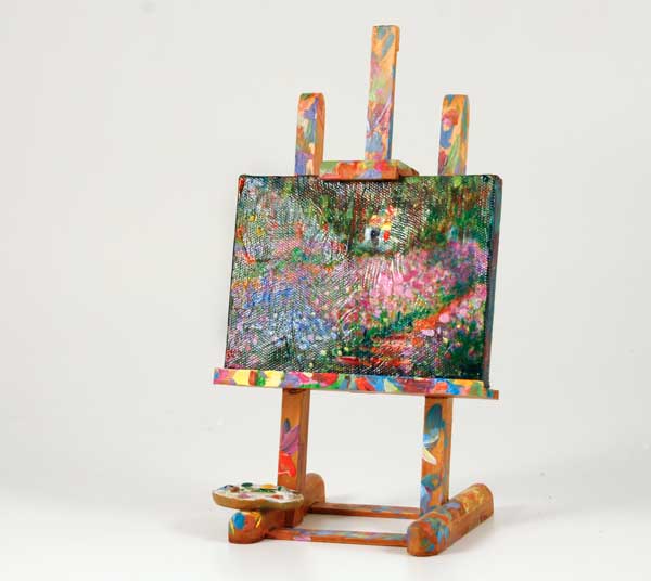
Some artists use their easels as palettes! They squeeze out their paints on regular palettes, but mix colors right on the easel supports! Use wood or metal easels, full scale or tabletop. Acrylic paints are practical because they dry fast, but oil paints work beautifully, too. 

After completing some paintings this way, you'll have generated a bonus masterpiece: an avant-garde artwork in the form of an easel. Your colorful easel will serve as an attention getter for displaying your paintings, too.

Varnish-Turp Magic

Try amazing transparent effects over a thoroughly dry oil painting. It works best on paintings of flat texture without heavy brushstrokes. Mix a solution of retouch varnish and 10% transparent oil color. I create a neutral from ultramarine blue and burnt sienna, but color is up to you.

Lay your painting flat and use a soft brush to coat the entire surface with the varnish solution. For areas where you want less color concentration, use varnish only. Now splatter and dribble turpentine onto the wet coating. Rings and organic shapes will develop and spread as the coating dries. To minimize the spreading effect dry your painting quicker by laying it in the warm sun--if possible.

Alcohol-Acrylic Magic

Create amazing effects by mixing a solution of 50% acrylic paint with 50% water. Apply the mixture to a dry canvas or board, which may or may not have been coated with acrylics. While the solution is still wet on your surface, splatter, drop, or dribble 91% alcohol onto your surface. The alcohol creates exciting rings and spots. Move the color around with a chopstick or brush handle. If you tilt your canvas, the alcohol will marbleize the paint. 

Try mixing metallic paint or iridescent powder into your 50-50% solution. Alcohol makes the metallic color separate from your acrylic color, creating outlined rings and surprising effects. Create layers of effects, letting the canvas dry flat between applications. This technique makes wonderful backgrounds as well as being their own statements.

*

Adding new products and techniques to your repertoire can put a jolt of freshness into your art without significantly changing your narrative. 

I have no affiliation with the products mentioned. This article first appeared in the February issue of "The Creative Edge," the newsletter of the California Art League.

Friday
Sep282012

Color Secrets

“In visual perception a color is almost never seen as it really is – as it physically is. This fact makes color the most relative medium in art.” – Josef Albers

Your color choices will greatly influence the viewer’s emotional reaction to your paintings. Remembering some general rules can help you express your ideas. 

“Audubon” from the Kleo Kats series, by Marjorie Sarnat

Know Your Relatives

Color is always relative. If a color is not working in your painting, adjusting the colors near it often solves the problem. For example, make a color appear brighter by surrounding it with duller colors. Surrounding areas have a profound effect upon the appearance of any color.

Keep It in the Family

A painting should have a dominant hue, with approximately ¾ in one color family. The remaining areas work well with complementary hues or another color temperature.

Brightening Up

Metallic acrylics mixed into acrylic white create gorgeous pastels that look non-metallic, but have a vibrant, less chalky hue than achieved by mixing flat colors into white. A bit of metallic color mixed into any flat color will intensify its hue, too.

Colors Have Character

When a painting has wonderful color harmony the palette usually has a common denominator, such as rich jewel tones, dusty pastels, or earth-tones. I call it the “character” of the colors.

Determine which colors express your visual statement. Gather or make color swatches, including discords and neutrals for accents. Name the group descriptively, such as “Sun-bleached” or “Etruscan.” A name helps you keep your colors’ character in mind as you paint. 

Pre-Mixed White Neutrals

Premix some warm and cool neutral whites so you have them ready for lightening a color. These whites will help keep your mixed colors rich. 

I keep gouache mixes in a small dish. When it dries out I add a bit of water, let it soak a few minutes, stir and use. You can keep acrylic mixes in airtight food storage containers. Add a drop of water now and then to keep the paint from drying out.

This is a great way to save white paint that is left on your palette, even if it has a bit of other color on it. Add it to your warm or cool premixes for future use.
(From “151 Uncommon and Amazing Art Studio Secrets,” Tip No. 93)

Black is Not the Absence of Color

Make rich, never-dull blacks by mixing burnt umber and ultramarine blue. This works for any kind of paint. Adjust the proportions to create warmer blacks (more umber) or cooler blacks (more blue).

The custom mixture makes gorgeous grays with white added. Adjust the warmth or coolness of the gray, as well. 

Replacing ready-made black paint with a custom mix will enliven your painting in subtle but important ways.
(From “151 Uncommon and Amazing Art Studio Secrets,” Tip No. 94)

Mixing Tip

When mixing a color, start with your lightest color and gradually add small amounts of the darker or brighter color to it so you don’t overwhelm it. This tip will save you a lot of paint.
Kid Friendly
(From “151 Uncommon and Amazing Art Studio Secrets,” Tip No. 95)

These rules and ways of handling color are tried and true guides that work for most cases. But in art and life, rules are meant to be broken. Let your own preferences be your final authority.

(Portions of this post originally appeared in the newsletter of the California Art League.) 

Friday
Apr272012

Brilliant Colors with Egg Tempera Made Easy

"Fairyland Twins" is a work I adapted from a Victorian pen and ink drawing from my collection of antique books. This example shows the vibrancy of color that can be achieved through egg tempera over watercolor.

A centuries-old painting technique is back, but without all the fuss. You don’t need to be a monk to illuminate your artwork with incredible detail and radiant color. Mix it in minutes and paint away! 

About Egg Tempera 

The egg tempera technique dates back to antiquity. The Ancient Egyptians used it to paint onto stone, and Byzantine artists in Europe used the medium for their illuminated manuscripts. Amazingly, their colors are still vivid today.

Advantages of Egg Tempera

  • Egg tempera produces glowing permanent colors, more vibrant than can be achieved with any other paint or medium.  
  • Egg tempera has a consistency that allows for incredibly fine detail and delicate line work. 
  • Egg tempera is opaque and bright, even over dark backgrounds.
  • When egg tempera is thinned with water, it becomes translucent. It is not as transparent as watercolor nor is it as opaque as gouache (opaque watercolor.) Layering brushstrokes creates gorgeous rich colors.
  • Egg tempera is a permanent medium after it dries. The colors will not fade.

Fast and Easy

Traditional techniques for painting with egg tempera are way too involved for most artists today, so I devised some fast and easy ways to work with the medium. All you need is an egg, water, and watercolors. I can’t guarantee works will last centuries like those of the great masters, but I, myself have paintings completed more than 30 years ago that are still bright and intact.

I’ve put it all together in “Brilliant Colors with Egg Tempera Made Easy.” (PDF 1.6 MB). You're welcome to this free download, and please let me know what you think. 

Friday
Apr202012

No. 13 Paper Mosaics

Create paint textures on any surface that can be cut into tiles after the paint dries. Use watercolor, acrylics, crayon, or ink. Adhere the tiles to a canvas, dimensional object, or any other surface with acrylic gel medium. Then paint over your tiled piece, using glazes and impasto techniques or simply coat with clear acrylic varnish.
Kid Friendly
[From “151 Uncommon and Amazing Art Studio Secrets”]

Friday
Apr202012

No. 68 Easy Under Drawing

Pastel pencils are a wonderful option for drawing guide lines for an under-painting. Use them on a toned canvas. 

The pastel pencils have several advantages. You can choose a color that will not muddy your first layers of paint, the pencils make fairly precise lines, and they are easily erased with a damp paper towel. 
Kid Friendly
[From "151 Uncommon and Amazing Art Studio Secrets"]